It is now possible to set the custom line spacing to be less than one in Google Docs and Google Slides
Maybe this doesn’t sound like a big deal but I really like this new functionality. It gives you much more control over the appearance of your document.
Really useful for formatting slides, where the layout of your copy is important visually. Especially when displayed in large format.
Here are a couple of line spacing tips that will help make your Docs and Slides look good and easy to read
Use tighter line spacing in headings
Headings are key to creating hierarchy in your layouts. They should be treated as a single unit, distinct from the body copy. One way to create that effect is to use tighter line spacing. As seen in this clip.
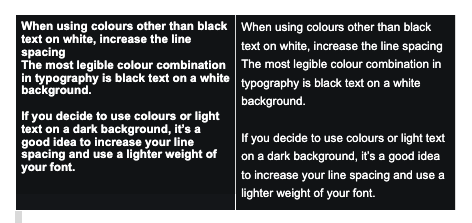
When using colours other than black text on white, increase the line spacing The most legible colour combination in typography is black text on a white background. If you decide to use colours or light text on a dark background, it’s a good idea to increase your line spacing and use a lighter weight of your font. Note text in the box on the right is easier to read.
 .
.